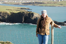
 This morning there was a blog post here - http://thecreativelife.typepad.com/blog/
I decided to download the template and see what I can do. This took me a few hours but I am pretty happy with the results since I am not very experienced...
Paper - Creative Fortune, Jen Wilson
Font - CTMH, Sea Captain
Picture Frame - Ray of Light, Meredith Fenwick
Comments please.... thanks!!!
Digi Layout - Breaffy House
Tuesday, April 15, 2008
Posted by Adriane Kelly Winchester at 2:34 PM
Subscribe to:
Post Comments (Atom)


4 comments:
LOVE the layout Adriane. You did a wonderful job.
Found you through the JW blog! Great job!
This looks awesome! Love how you used the framing in the middle and those papers look gorgeous here. Nicely done, and thanks for participating in the challenge. Your blog is great! I'm another woman possessed by wanderlust, although these days my travels take me from preschool to Kindergarten and on over to the grocery store, lol.
Hi Adriane,
Great job on this layout, I love the postage stamp edged frames. Hope you enjoyed my class and looked forward to seeing you again.
Smiles, Paula
Post a Comment